 Skip to content
The evolution of modern home design has transformed the way Omaha homeowners approach interior color schemes, with open concept floor plans becoming the dominant architectural choice in contemporary residences throughout the metro area. Unlike traditional compartmentalized homes where each room functioned as an independent color story, open concept living spaces require sophisticated color coordination strategies that create visual harmony while defining distinct functional areas within unified spaces. Understanding how to achieve seamless paint flow throughout open concept homes enables Omaha homeowners to maximize their architectural investment while creating cohesive, visually appealing environments that enhance both daily living and property values.
The challenge of painting open concept homes lies in balancing unity and variety—creating enough visual connection between spaces to maintain flow while establishing sufficient definition to distinguish different functional areas. Modern Omaha homes featuring great rooms that combine kitchen, dining, and living areas require color strategies that acknowledge shared sight lines while supporting the practical needs of diverse activities occurring within connected spaces.
Understanding Open Concept Color Psychology
Open concept spaces function differently from traditional room-by-room layouts because visual boundaries become suggestions rather than barriers, requiring paint colors to work harder in defining spaces and managing energy flow. Individual colors affect mood and perception while color relationships between adjacent areas influence how occupants move through and experience connected spaces. Warm colors naturally draw people together and create intimate gathering areas, making them effective for defining conversation zones, while cool colors recede visually and can help establish calming retreat areas or make spaces feel larger.
The visual weight of different colors becomes particularly important in open concept design because heavy, dark colors can create unintended focal points that disrupt flow, while light colors may fail to provide adequate definition between functional areas. Understanding how colors interact across open sight lines helps homeowners choose palettes that enhance rather than compete with architectural features like vaulted ceilings, exposed beams, or large windows that characterize many modern Omaha homes.
Color temperature consistency throughout open concept spaces provides the foundation for successful coordination, with warm undertones creating cozy atmospheres while cool undertones promote calm, spacious feelings. Mixed color temperatures within open sight lines often create visual tension that makes spaces feel disjointed. Omaha’s abundant natural light from large windows can significantly affect how color temperatures appear throughout the day, making it essential to consider how morning light differs from afternoon sun in revealing color undertones.
The 60-30-10 Rule for Open Concept Spaces
The classic 60-30-10 color rule takes on enhanced importance in open concept homes because it provides a mathematical framework for achieving balance across large, connected spaces while ensuring adequate variety to maintain visual interest. In open concept applications, the dominant 60% color typically covers the majority of wall surfaces throughout connected areas, creating the foundational color story that unifies the entire space. This dominant color should be neutral enough to support various activities and furniture arrangements while being distinctive enough to establish a clear design personality.
The secondary 30% color often appears in feature walls, built-in cabinetry, or architectural elements that help define different functional zones within the open concept layout. Strategic placement of this secondary color can guide traffic flow, highlight architectural features, or create visual anchors that prevent large spaces from feeling undefined or overwhelming. In many Omaha homes, the 30% color might appear as a darker shade on the kitchen island, a feature wall behind the dining area, or accent color on a fireplace surround that serves as a natural gathering point.
The accent 10% color provides opportunities for personality and seasonal flexibility through accessories, artwork, textiles, and smaller painted elements that can evolve with changing preferences without requiring major repainting projects. This accent color should complement both the dominant and secondary colors while adding enough contrast to create visual punctuation and prevent the overall scheme from appearing flat or monotonous.
Implementing the 60-30-10 rule in open concept spaces requires careful consideration of how colors will be distributed across connected areas, ensuring that the proportions remain visually balanced when viewed from different vantage points throughout the home.
Creating Zones with Color Transitions
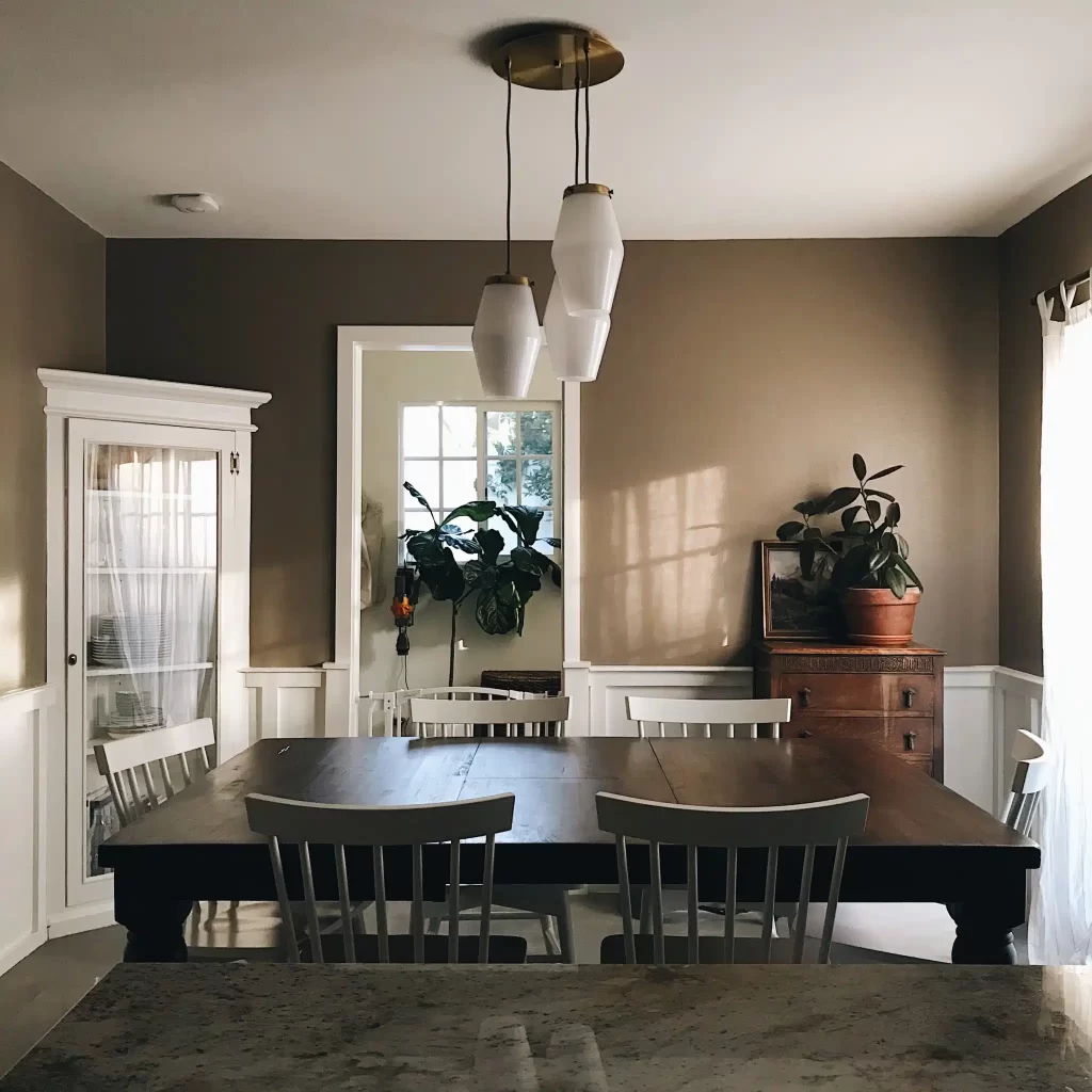
Effective zone definition in open concept homes relies on subtle color transitions that provide visual cues about functional areas without creating jarring contrasts that disrupt overall harmony. Successful zoning strategies often employ variations of the same color family, using different saturations or undertones to distinguish between spaces while maintaining cohesive flow. For example, a warm gray might unify the entire great room while a slightly deeper version defines the dining area and a lighter variation highlights the kitchen.
Architectural features provide natural opportunities for color transitions, with elements like kitchen islands, half walls, or ceiling changes offering logical places to introduce new colors that support functional differentiation. Many modern Omaha homes feature kitchen islands that serve as both workspace and casual dining areas, making them ideal candidates for accent colors that define the kitchen zone while complementing the surrounding palette.
Ceiling color represents an often-overlooked opportunity for zone definition, particularly in open concept homes with varied ceiling heights. Painting kitchen ceilings in slightly different colors from living areas can help define functional zones while maintaining wall color continuity, creating subtle spatial definition without interrupting sight lines.
Flooring transitions between different materials provide natural opportunities for coordinating paint transitions that reinforce functional boundaries. Colors that complement specific flooring materials help establish zone identity while contributing to overall design cohesion.
Lighting Considerations for Color Coordination
Omaha’s distinctive lighting conditions throughout the seasons significantly impact how paint colors appear in open concept spaces, making it essential to evaluate color choices under various lighting scenarios. Large windows typical of modern open concept homes create dramatic lighting changes throughout the day, with morning light revealing different color characteristics than afternoon or evening illumination. North-facing windows provide consistent, cool light that can make warm colors appear muted while enhancing cool colors, while south-facing exposures bathe spaces in warm light that intensifies warm colors.
Artificial lighting systems must coordinate with paint colors to maintain color harmony during evening hours. LED lighting with adjustable color temperatures offers flexibility in supporting different color schemes while providing energy efficiency. Warm white LED lighting enhances warm paint colors and creates cozy evening atmospheres, while cool white lighting supports contemporary color schemes.
Testing paint samples under various lighting conditions throughout the day helps ensure that color choices remain attractive and functional regardless of time or season. This becomes particularly important in open concept spaces where multiple lighting sources must work together to create unified ambiance across connected areas.
Omaha-Specific Design Considerations
Nebraska’s continental climate creates unique challenges and opportunities for interior color coordination, with dramatic seasonal changes influencing how homeowners experience their living spaces throughout the year. During long winter months when outdoor views are dominated by snow and bare landscapes, interior colors carry increased responsibility for maintaining visual warmth and interest. Warm color palettes featuring earth tones, soft blues, or rich greens can provide psychological comfort during cold periods while creating inviting environments for indoor entertaining.
Summer’s intense sunlight and lush green landscapes offer opportunities for cooler interior palettes that create refreshing contrasts to outdoor heat while complementing views of gardens and tree-lined neighborhoods common throughout Omaha. Homes with significant window exposure may benefit from color schemes that remain comfortable during bright summer days while avoiding colors that fade or appear washed out under intense sunlight.
Regional architectural styles prevalent in Omaha influence appropriate color coordination strategies, with Prairie School influences, mid-century modern elements, and contemporary designs each suggesting different approaches to open concept color flow. Prairie-inspired homes often feature natural material palettes that coordinate beautifully with earth-tone paint schemes, while contemporary designs offer the greatest flexibility for color experimentation.
Trending Color Combinations for Modern Omaha Homes
Contemporary open concept color trends emphasize sophisticated neutrals as foundational colors, with warm grays, greige (gray-beige blends), and soft whites providing versatile backgrounds that support various decorating styles and lifestyle changes. These neutral foundations pair beautifully with accent colors that reflect current design preferences while remaining timeless enough to avoid frequent repainting. Popular accent combinations include navy blue with warm brass fixtures, sage green with natural wood elements, or terracotta with cream for spaces that embrace earthy sophistication.
The farmhouse modern aesthetic popular throughout Omaha combines traditional comfort with contemporary clean lines, often featuring crisp white walls as the dominant color with natural wood elements providing warmth and texture. This approach works particularly well in open concept spaces because white maximizes natural light and creates seamless flow between areas while allowing furniture, artwork, and accessories to provide color and personality.
Bold accent walls have evolved from single statement walls to more sophisticated applications that support open concept flow, such as extending bold colors through multiple connected spaces or using gradient effects that transition between areas. Deep blues, forest greens, or charcoal grays can provide dramatic backdrop for furniture groupings while creating visual anchors that help define functional zones.
Professional Application Techniques for Seamless Results
Achieving professional-quality results in open concept color coordination requires advanced application techniques that ensure smooth color transitions and consistent coverage across large, connected surfaces. Proper surface preparation becomes particularly critical in open concept spaces because imperfections are more visible across long sight lines, making thorough cleaning, patching, and priming essential for achieving smooth, even surfaces that showcase coordinated color schemes effectively.
Color matching between different paint batches assumes greater importance in open concept applications where color consistency across large areas is essential for maintaining visual harmony. Professional painters use techniques like box mixing multiple paint gallons to ensure color consistency and plan application sequences that minimize visible lap marks or color variations that could disrupt the coordinated appearance.
Maintaining Color Harmony Over Time
Long-term success with open concept color coordination requires planning for inevitable touch-ups, repairs, and updates that occur as homes age and family needs evolve. Keeping detailed records of paint colors, batch numbers, and application dates helps ensure that future touch-ups match existing colors accurately. Many homeowners benefit from purchasing extra paint during initial application for future touch-ups, storing it properly to maintain color integrity over time.
Regular maintenance cleaning becomes particularly important in open concept spaces where dirt, scuffs, or fading in one area can disrupt the overall color harmony. Using paint finishes appropriate for each area’s function—such as semi-gloss in kitchens and satin in living areas—helps maintain consistent appearance while providing appropriate durability for different usage patterns.
When you’re ready to transform your Omaha home with professionally coordinated open concept color schemes that enhance your modern lifestyle while increasing your property value, contact Straight Line Painting for expert consultation and flawless application. Our experienced team understands the unique challenges of open concept color coordination and can help you achieve the sophisticated, harmonious results that make your home a showcase of contemporary design. Let us help you create the seamless color flow that turns your open concept space into the stunning, functional environment you’ve always envisioned.